
For decades, Hollywood’s greatest filmmakers worked in black and white, crafting some of the most iconic images ever put on screen. The interplay of light and shadow, the depth of contrast—it wasn’t just a necessity, it was an art form. But as technology advanced, the industry embraced a new cinematic tool: color. And with that transition, the visual language of film changed forever.
Now, black-and-white cinematography wasn’t just a relic of the past—it was a deliberate artistic choice. Early Hollywood relied on it because, well, that’s what was available. But filmmakers quickly learned how to use it to their advantage, creating stunning compositions that still hold up today. Think of the moody noir shadows in Double Indemnity, the stark beauty of Casablanca, or the haunting imagery of Psycho. These films weren’t missing color—they thrived without it.
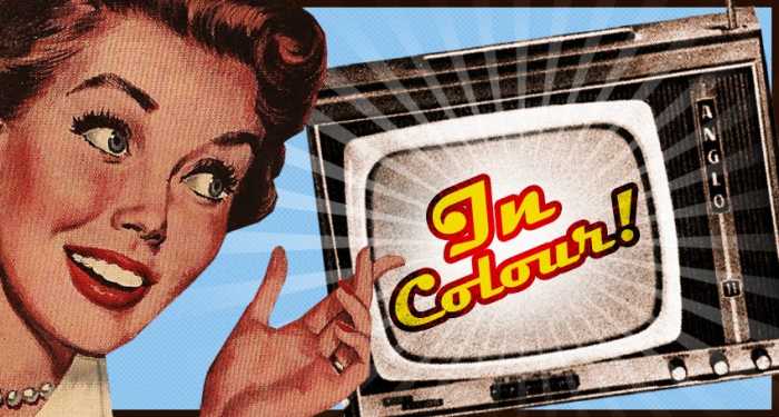
Then came Technicolor. The process had been around in various forms since the 1910s, but it wasn’t until the 1930s that it really took hold. Becky Sharp (1935) was the first full-length feature shot entirely in three-strip Technicolor, and suddenly, Hollywood had a new way to dazzle audiences. And dazzle they did. The Wizard of Oz, Gone with the Wind, Singin’ in the Rain—these films weren’t just colorful, they were vibrant, immersive, and unforgettable.
Color cinematography opened up new possibilities for storytelling. Filmmakers could use hues to evoke emotion, set a mood, or transport audiences to fantastical worlds. The rich reds of An American in Paris, the golden glow of The Searchers, the surreal blues and greens of Vertigo—color became an essential part of the cinematic experience.
But even as color took over, black and white never truly disappeared. Some directors chose it deliberately, knowing that its stark simplicity could enhance a film’s atmosphere. Schindler’s List, Raging Bull, The Last Picture Show—each of these films used black and white not as a limitation, but as a powerful storytelling tool.
And then there were the films that blended both. The Picture of Dorian Gray (1945) used selective color to highlight the infamous portrait. Pleasantville (1998) transitioned from black and white to color as its characters discovered new perspectives. These choices weren’t just technical—they were deeply tied to the themes of the films themselves.
The transition from black and white to color wasn’t just a technological shift—it was a transformation in the way filmmakers told stories. Today, we celebrate both, recognizing that each has its place in cinema history. Whether it’s the timeless elegance of black and white or the expressive richness of color, the magic of the movies remains as powerful as ever.


: A Delightful Little Gem")
: A Thrilling Reminder of Democracy’s Fragility")